Email me yuckystudio@gmail.com

Krakow

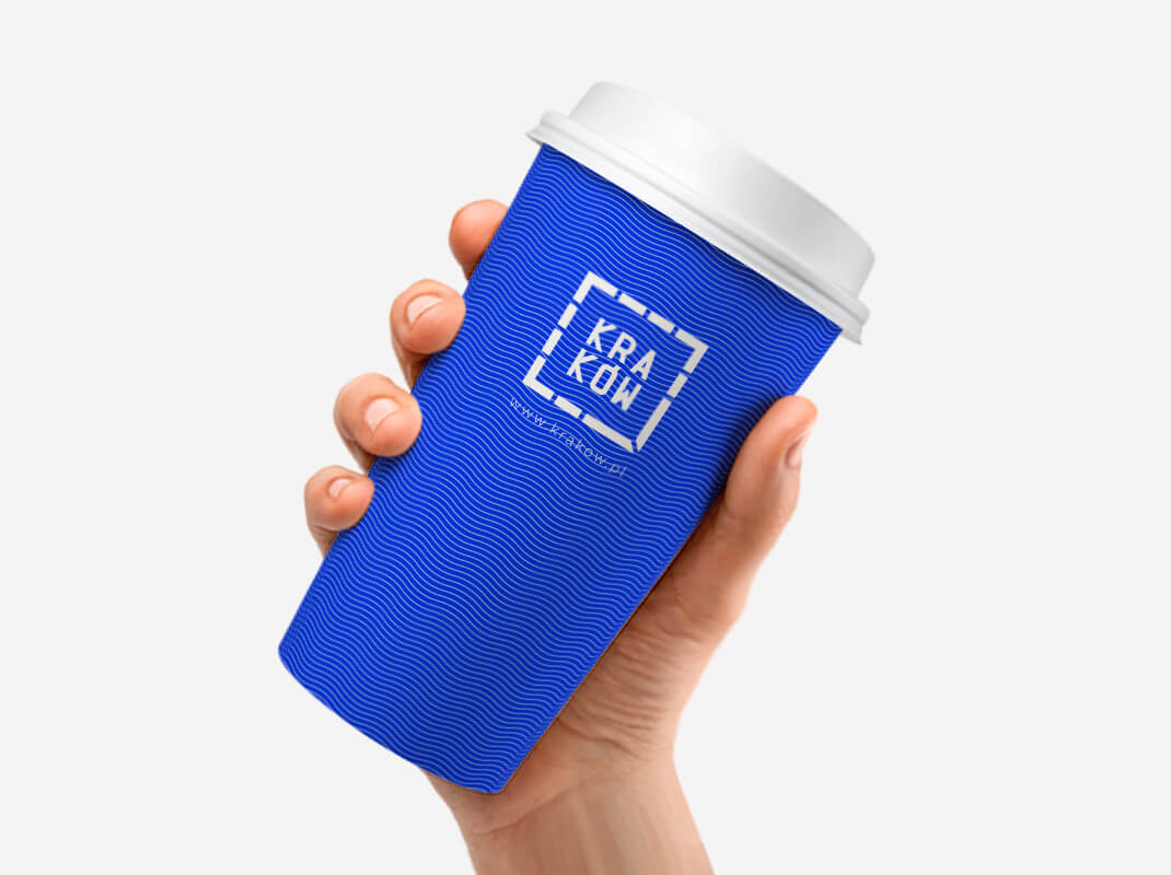
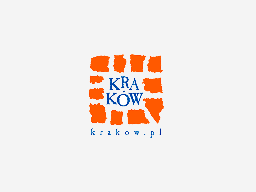
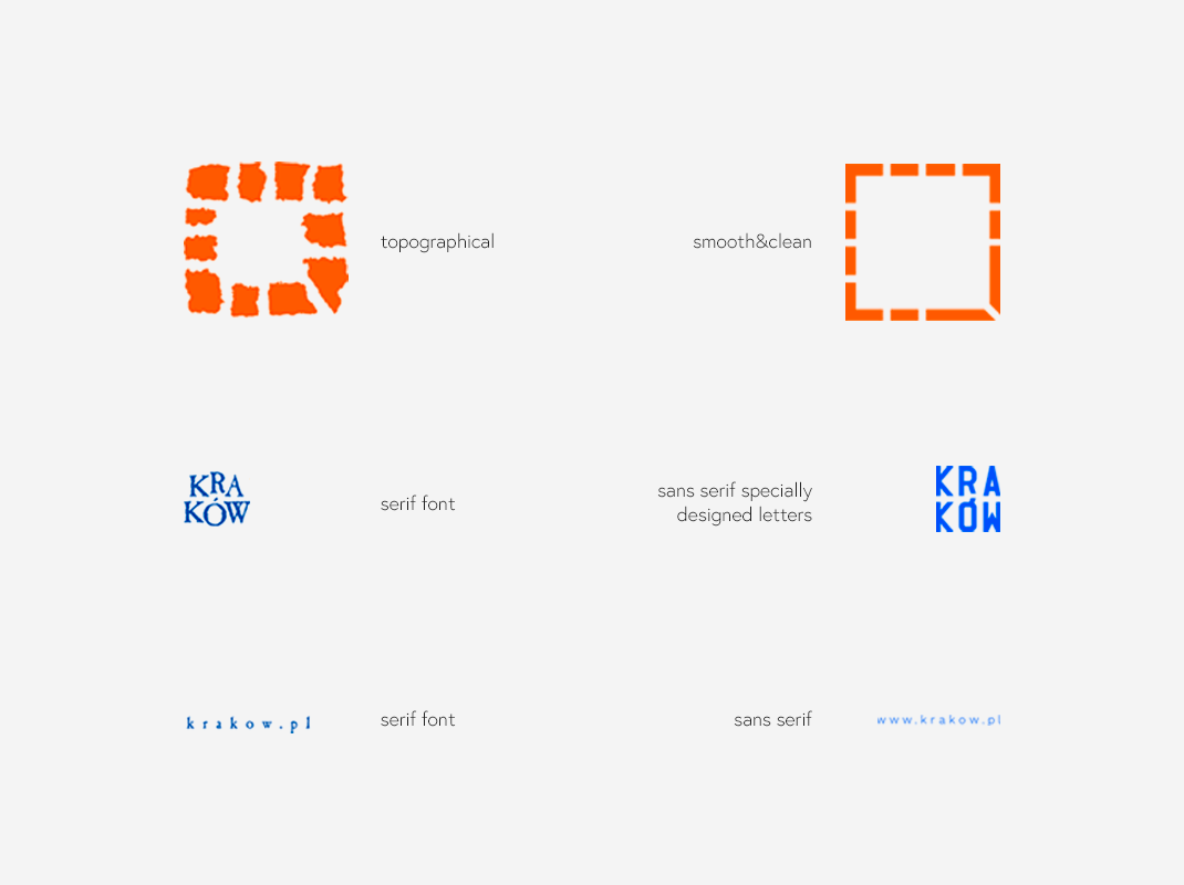
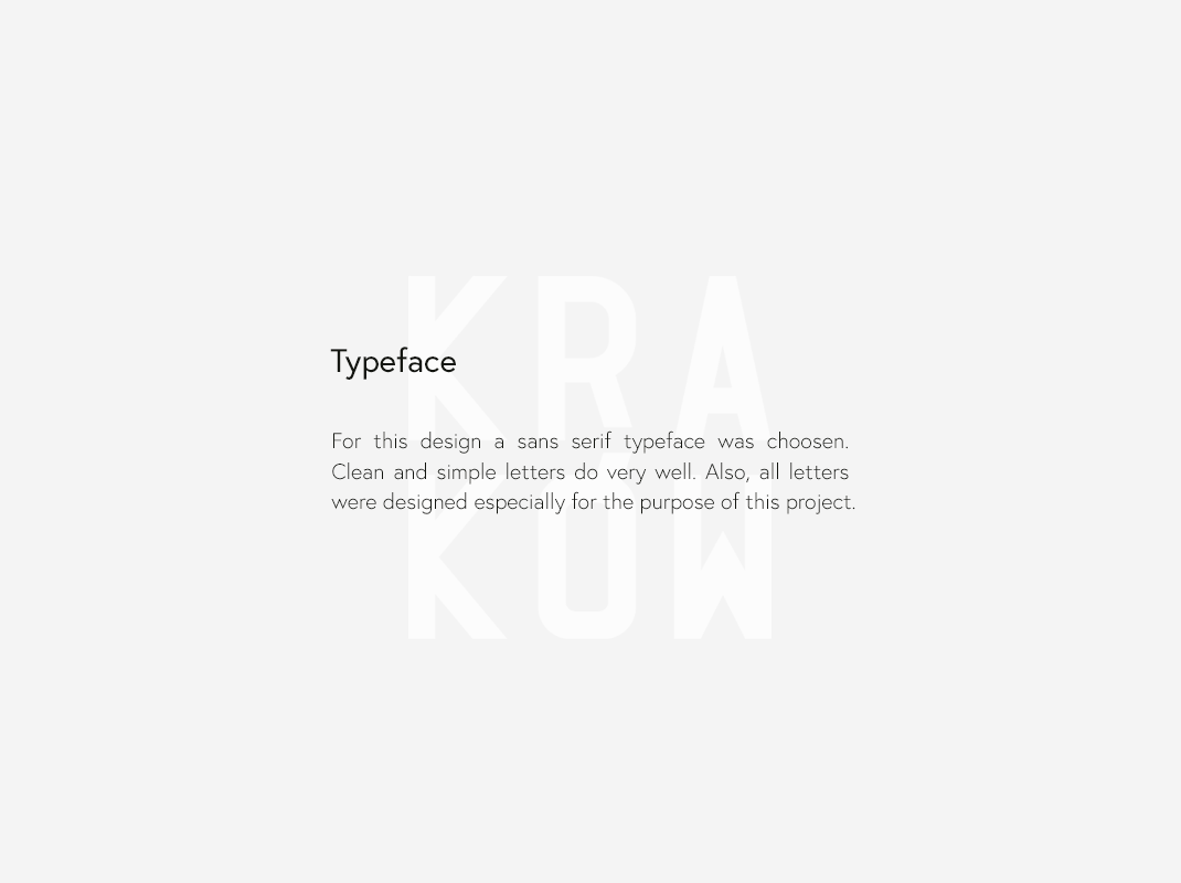
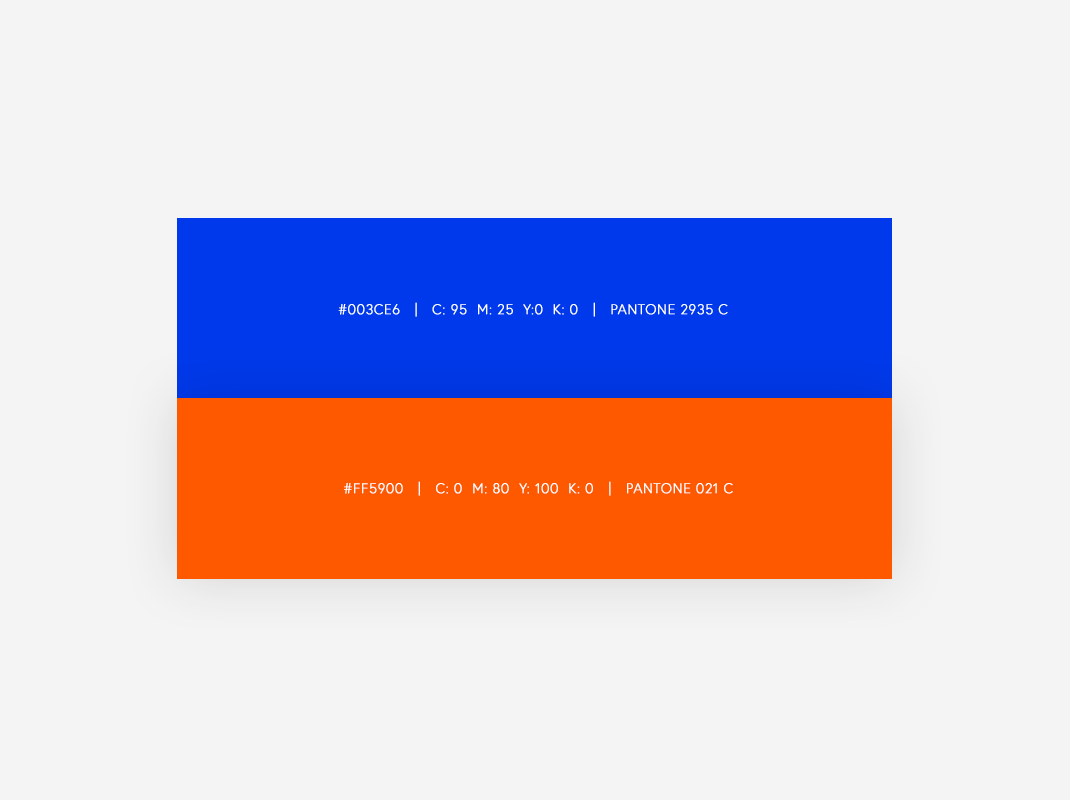
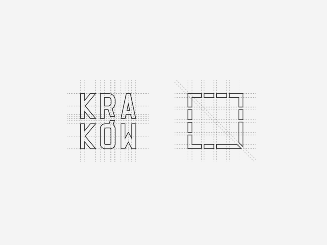
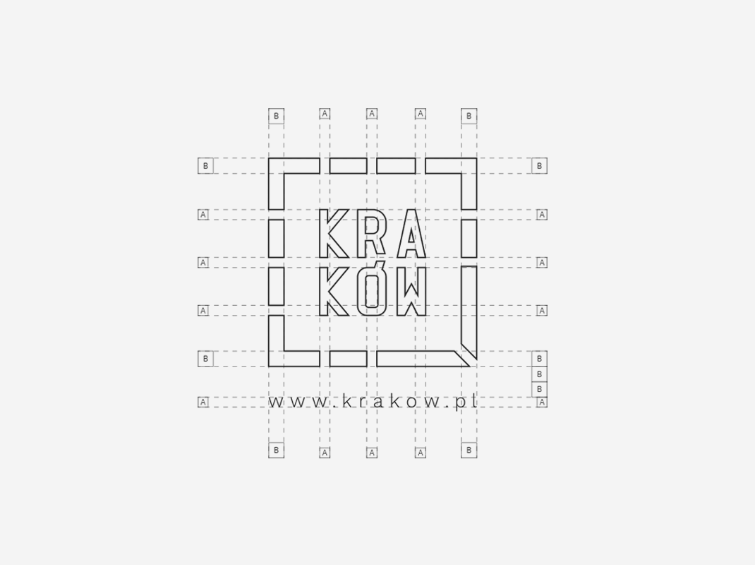
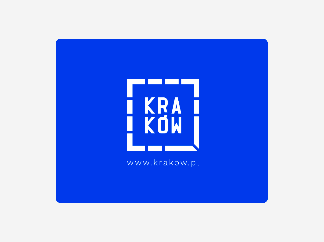
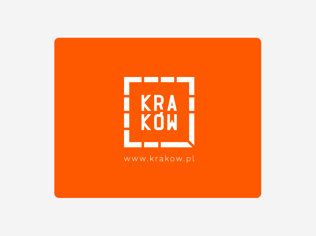
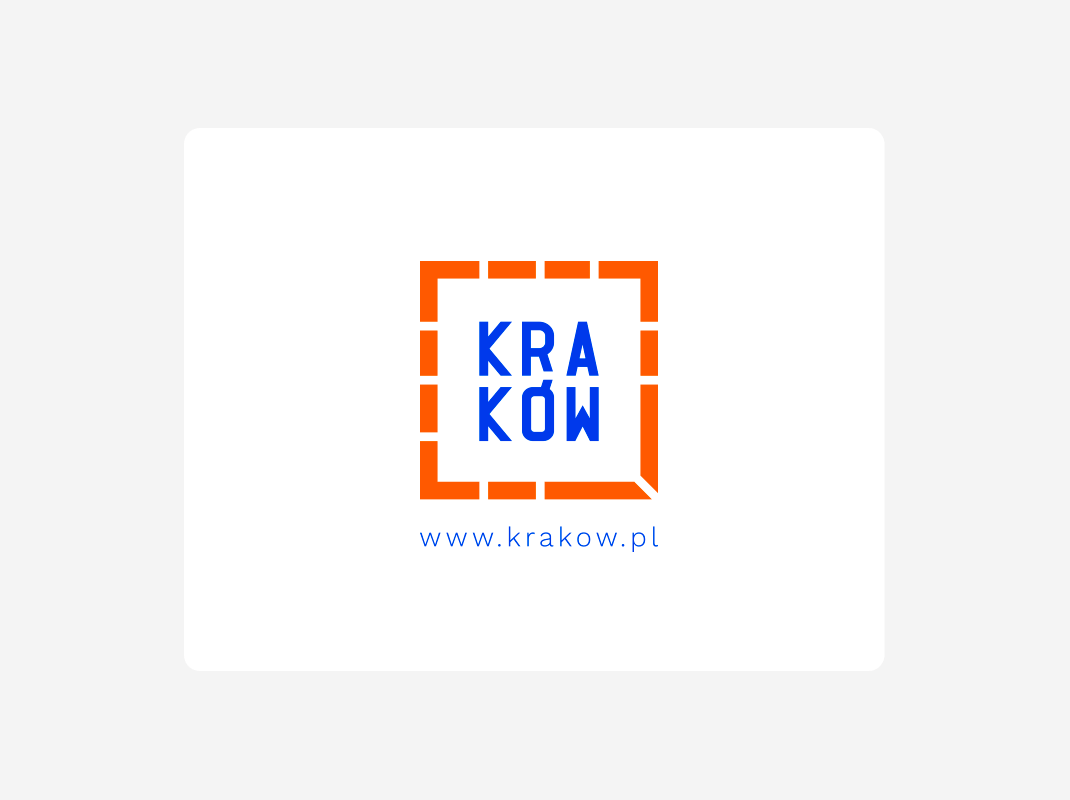
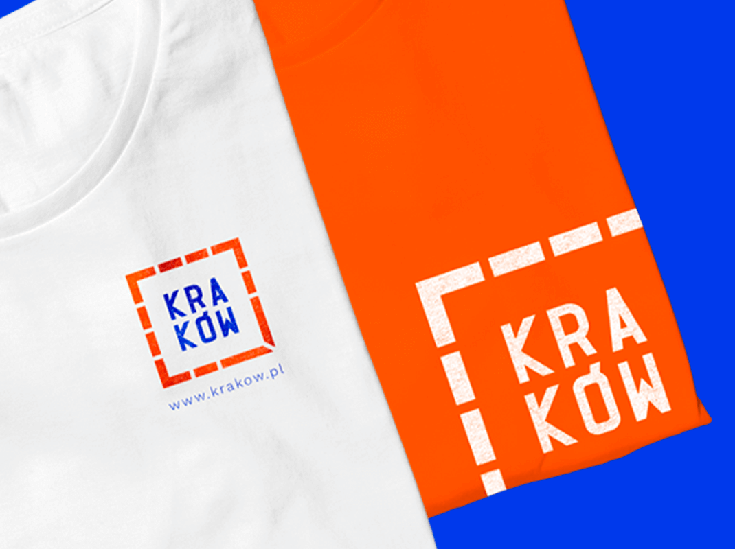
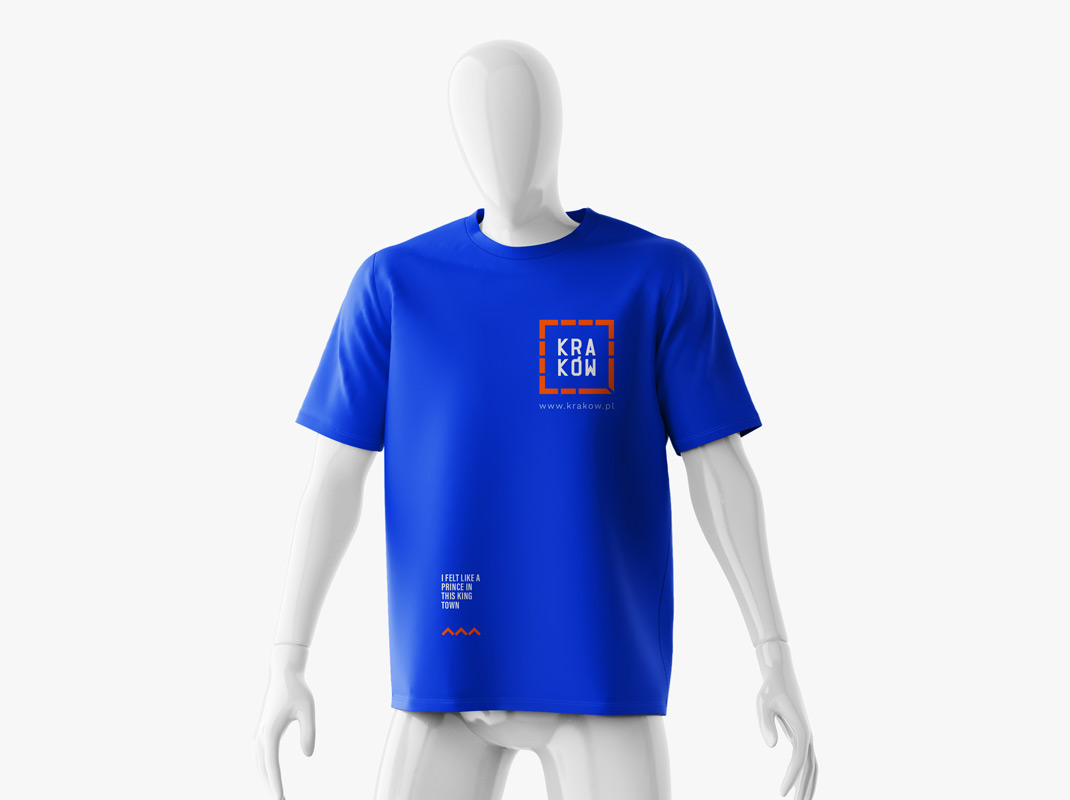
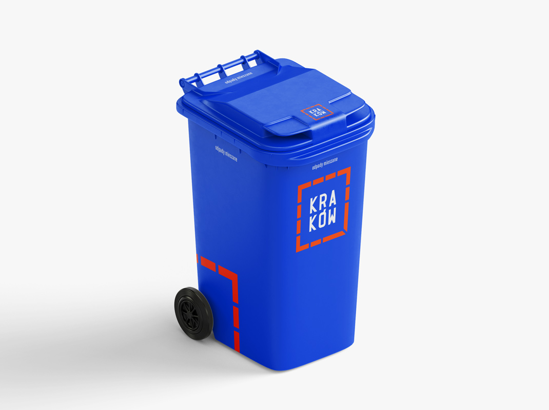
This represent only an idea of the city’s primary logo redesign while keeping the symbolism unharmed but adding a little touch of “modern” form. Nothing fancy, just adaptable. Nothing breathtaking, just more pleasant. As everything in design industry this is also subjective.

Our Client
For who:
  • The City of Krakow
We've made
Scope of work
  • Research
  • History & symbolism
  • Redesign
Available on:
Previous logo
The logo uses two colors. Orange represents the tenement houses around the main square. There are 11 streets between tenement houses. Blue is a very important color for Krakow. Its symbolism comes from the Vistula River by which the city is located. The blue color is visible on the city’s flag and used on public transport vehicles.
Go back/up